Salsify Website Rebuild
Content Creation: Peter Crosby and Cara Wood | Front-end development: Josh McCarroll
Project Management | Design Research | Illustration | Design
The goal going into this project was to incorporate a new product offering for retailers into the Salsify website.
Instead of simply focusing on the retail product, using the site to tell a story about the changing relationship between brands and retailers in the digital market place could establish Salsify as not only having a solution for both, but as an expert in ecommerce.
Through doing user research at the beginning of the project, we set out a few guiding principles that informed navigation, layout and content design.
Focus on the problem first: For the most part, brands and retailers are adapting to change they don't totally understand. Salsify has built a product with its focus ultimately on the experience of everyday people buying products online.
Focus on the solution second: Salsify's solution makes the most sense when set against the problem.
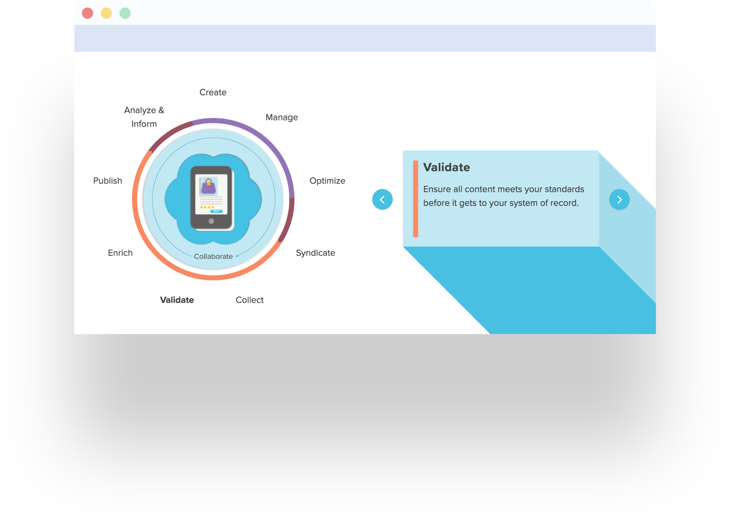
Differentiate from the competition with style: Creating content card styles, artwork for each unique piece of content, and engaging illustrations on each page, we realized we could easily differentiate Salsify from the competition, who really weren't placing any special focus on making their sites look beautiful.


