StreetEasy map search project
StreetEasy is Zillow's dedicated experience for finding real estate in New York City. As the lead designer tasked with identifying product opportunities in StreetEasy's top-of-funnel searches — I created executive level buy-in to invest in creating a map search experience. The new map experience that I designed resulted in a 9% increase in customers connecting with agents, a crucial revenue metric for StreetEasy.
My role
Product Design Lead for the Top-of-Funnel Search workstream
Results
9% lift in agent connection
Background
As a marketplace, StreetEasy depends on both audience and inventory to retain its dominance as the go-to platform for agents to post listings in New York and for buyers and renters to find them. By early 2023, several companies were attempting to disrupt our position by offering superior search experiences. As a result, poorer search experiences on our platform were causing fewer customers to contact agents, which in turn reduced commission revenue for StreetEasy. To address this gap, a new working group was created and I was put in charge of our design strategy.
StreetEasy’s revenue funnel relies on buyers successfully finding listings they are interested in
Prioritization
UX Research identified 30 problems that users encountered when searching for and finding listings on StreetEasy. To decide which solution to prioritize, we applied the RICE framework, popularized by Sean McBride at Intercom. After applying the framework, we identified three initial projects to fill our roadmap - the first being a map search experience.
The RICE framework evaluates priorities based on four factors:
Reach: How many users are likely to encounter the problem or benefit from the solution.
Impact: The extent to which addressing the problem will help customers achieve their goals.
Confidence: How certain the team is that the problem is real and the proposed solution will be effective.
Effort: The amount of work required to resolve the problem.
To tailor the framework for StreetEasy, we added a fifth factor to account for our size and the focus needed to make a meaningful impact: Product Relevance. Given our small team, it was essential to consider how aligned a problem was with other product priorities.
Evaluating our opportunities through this lens highlighted the importance of prioritizing improvements to the map search experience.
Competitive analysis
Competitive analysis made the absence of a searchable map glaringly obvious. User research also showed us that, when evaluating listings, geographical context is essential for buyers. They don’t just want to know about what’s within the four walls of the home - they want to know where it is in relationship to the rest of their lives. When comparing StreetEasy with three competitors, ours is the only map that didn’t display all listings from a search and cannot be used to navigate directly to Home Detail pages.
The density problem in NYC
Unlike most places in the United States, homes in New York are often stacked on top of one another. This creates challenges for New Yorkers looking for homes, where it’s often difficult to zoom in close enough to select a single listing among the many stacked on top of each other.
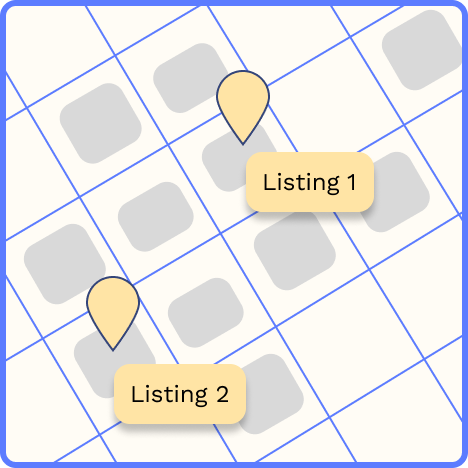
In most places, a listing is going to take up one grid area of space on an X and Y axes.
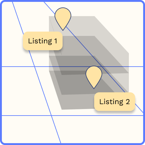
Multiple listings are often available in one building - introducing complexity that could make a map very crowded.
Typically, when searching on a map, a single item occupies a distinct location on the X and Y axes. However, because multiple listings can exist within the same building, we needed a solution that would allow users to easily access all the listings in a given area when searching on our map.
Below, I outline three ways I solved for the density problem with this project.
Building cards to the rescue
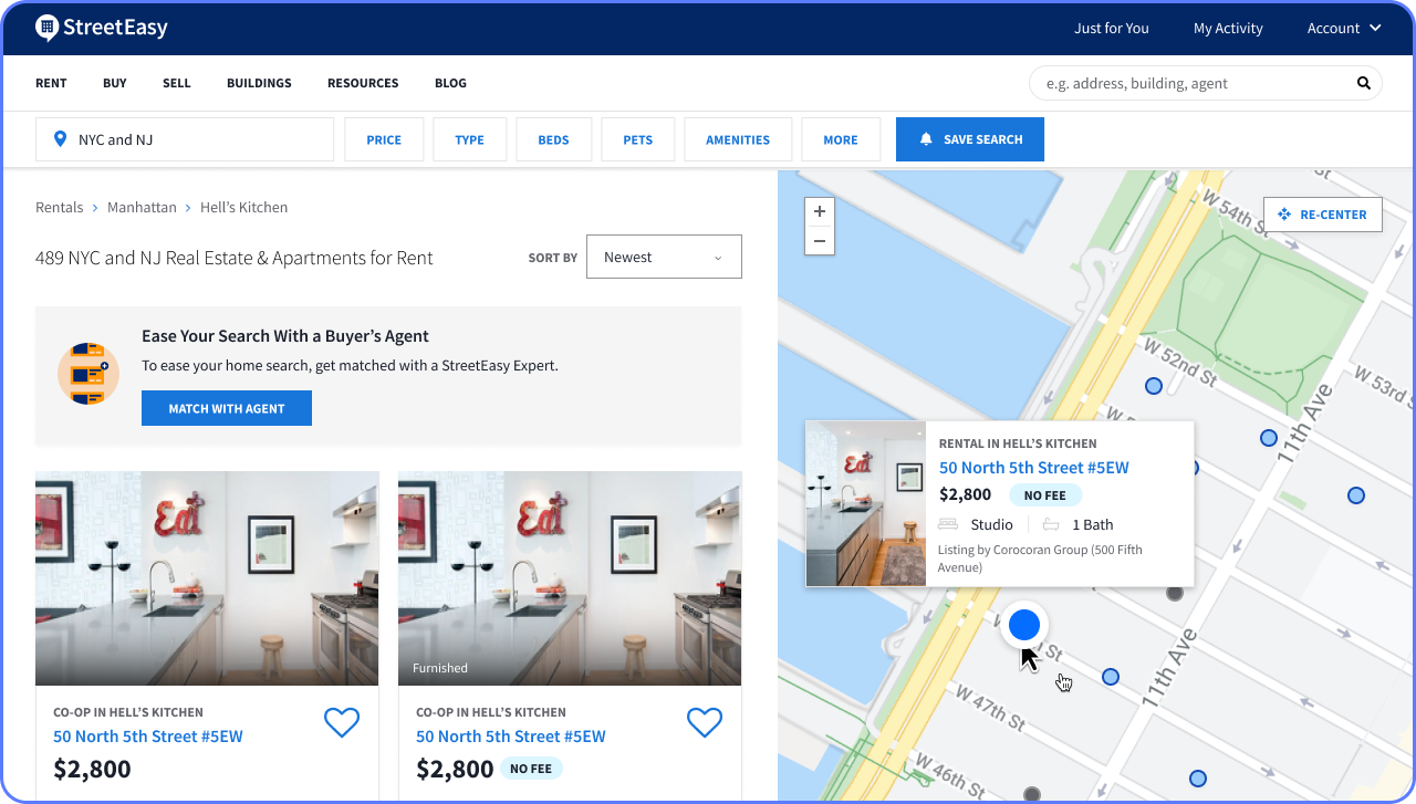
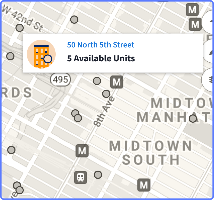
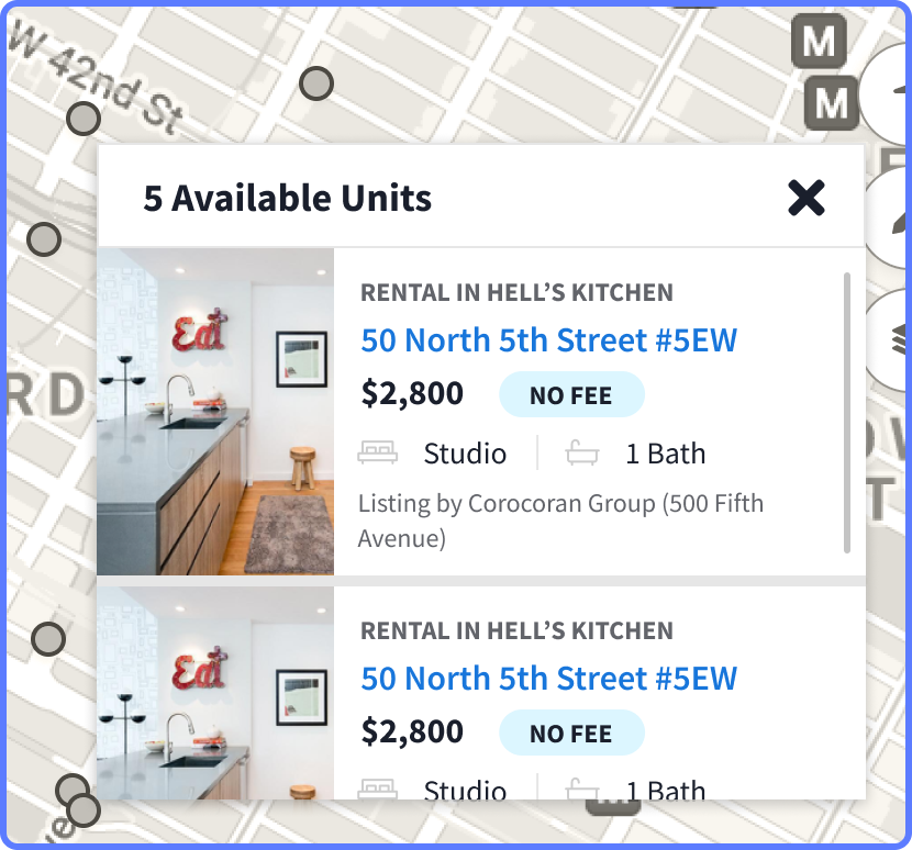
To address this issue, I introduced a new type of object to our map: the building card. When multiple listings existed within the same building, we displayed a building card instead of individual listing cards. Clicking on the building card opened a modal showing all available listings, allowing users to scroll through and select the one that interested them. For standalone listings, a standard listing card—similar to those found on other real estate sites—would appear.
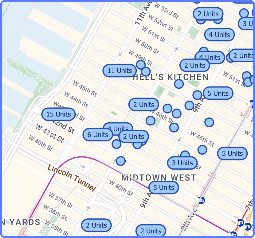
When a building with multiple listings is hovered over, a user is able to see the number of available listings.
When clicked on, the map is frozen, and the user is able to scroll through a list of listings.
If a listing is alone in a building, the user simply sees the listing on hover.
Solving for different needs at various map zoom levels
We recognized that users' needs would vary depending on their zoom level. For example, a user viewing the entire Manhattan and Brooklyn area would have different requirements compared to when they were zoomed in on a few blocks within a specific neighborhood.
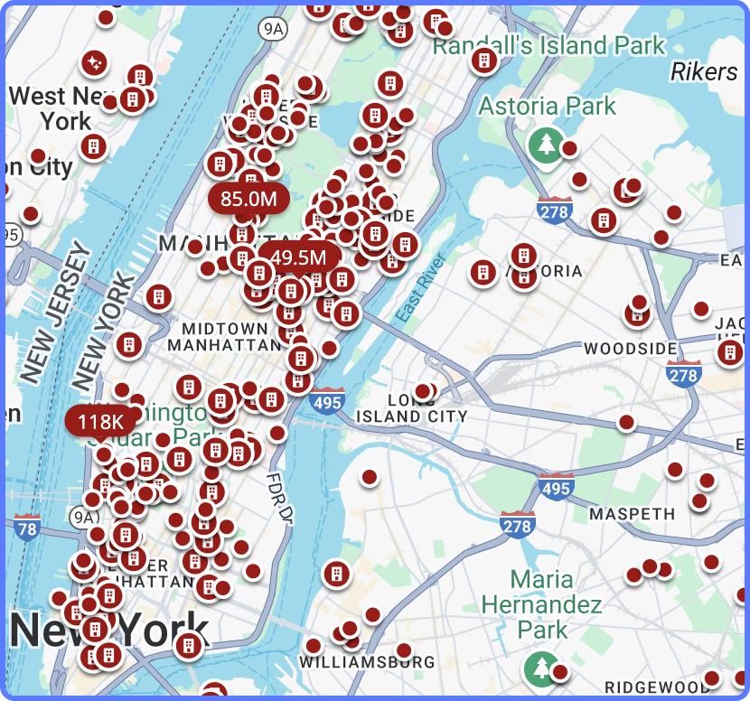
When looking at all of Manhattan, listings markers begin to overlap - making the map difficult to use.
When zoomed in, a user can easily find specific listings they are interested in.
Different map markers for different user needs
I determined that, at a high level, map markers serve primarily as navigation tools. At this zoom level, a map marker can indicate where available listings are worth exploring and highlight areas with fewer listings.
At the highest Z-index, all available listings become grouped in a single marker that uses size to indicate the number of available listings.
At medium Z-indexes, the user can see the difference between buildings with multiple units, and individual listings.
Zoomed in, we have a low enough density to allow for more information about price to come forward on the listing markers.
Pairing with engineers to establish Z-index rules
To ensure we implemented the appropriate markers at the correct Z-indexes, I collaborated with the lead engineer on this project. This saved time and solved a problem that may have otherwise created a lot of wasted time. Instead of me guessing at what the right density might be, sharing a recommendation, and waiting to see a link in a testing environment, we had several collaborative sessions where we examined how the markers would appear at various map heights using real data. This analysis helped us determine the optimal density for displaying individual markers and those with pricing information.
Results
After launch the new map resulted in a 9% increase in conversions. Thanks to this improvement to buyers being able to explore more listings of interest in a single session, as they gained essential geographical context for each listing.

